- Author Nora Macey macey@family-relation.com.
- Public 2023-12-16 10:17.
- Last modified 2025-01-23 08:47.
Finding patterns is an important stage in any research work. Having identified how this or that process changes, having determined its dependence on other processes, the researcher can draw very specific conclusions, often capable of bringing practical benefits.

Necessary
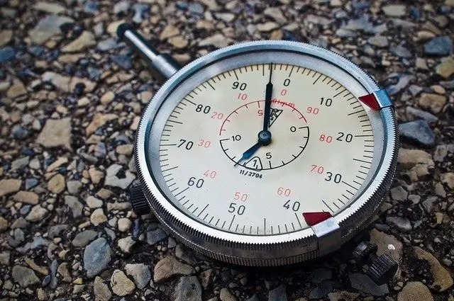
- - measuring instruments;
- - Microsoft Office Excel program;
- - statistical programs;
Instructions
Step 1
To try to find a pattern, first select a method for registering the process under study. In many cases, one or another technical measuring device is needed for this - for example, a thermometer, clock, barometer, etc.
Step 2
Determine the measurement frequency. For example, you decided to find out how the pressure changes during the day, whether there is a pattern in this process. For measurements, you need a barometer and a watch. The frequency of measurements can be taken in one hour, which means that you will make 24 measurements in a day.
Step 3
Measurements completed - do they provide insight into the dynamics of the process being changed? You can see that the pressure changed somehow during the day. But is there a pattern here? To find out, it is necessary to take a series of measurements - for example, over the course of a week. If after that it will be seen that every day the pressure changes in a certain way, it will be possible to conclude that in this case there is a pattern, and you were able to identify it.
Step 4
Very often, a researcher receives a number of numbers that are not informative in themselves; it can be very difficult to identify a pattern in them. If you do not conduct scientific research and you do not need to prove the reliability of the results obtained, then in order to identify patterns, the easiest way is to translate the obtained values into a visual form - for example, to present them in the form of graphs.
Step 5
Use Excel from Microsoft Office to build graphs. Run it and write the results in the columns. If you took measurements for seven days, twenty-four times a day, then you get seven columns, with twenty-four values in each. To make the graphs more informative, you can discard their common part for all values. For example, the pressure is 755 mmHg - drop 700 and keep only 55. This is not really a scientific method, but it is very convenient for quickly analyzing the results. If we do not discard the common part, the range of changes will be small, and the graphs will resemble straight lines.
Step 6
Select all seven columns, then select: "Insert" - "Chart" - "Graph", click the "Next" button, then "Finish". You will see all seven graphs, and you will immediately see if there is any pattern in the collected data. If there is one, all the graphs will be very similar. If not, then it was not possible to identify an explicit pattern.
Step 7
Statistical software should be used to accurately analyze the collected data. On the net you can find programs for almost any task. Many of them are paid, but there are many free utilities, among which you can easily find a suitable one.


